


Website Rebranding
& Redesign
A design intervention to increase digital exposure and lead generation for a new & growing chiropractic clinic
My Role
UX/UI Designer
Website Designer
Project Type
Website Rebrand
Background
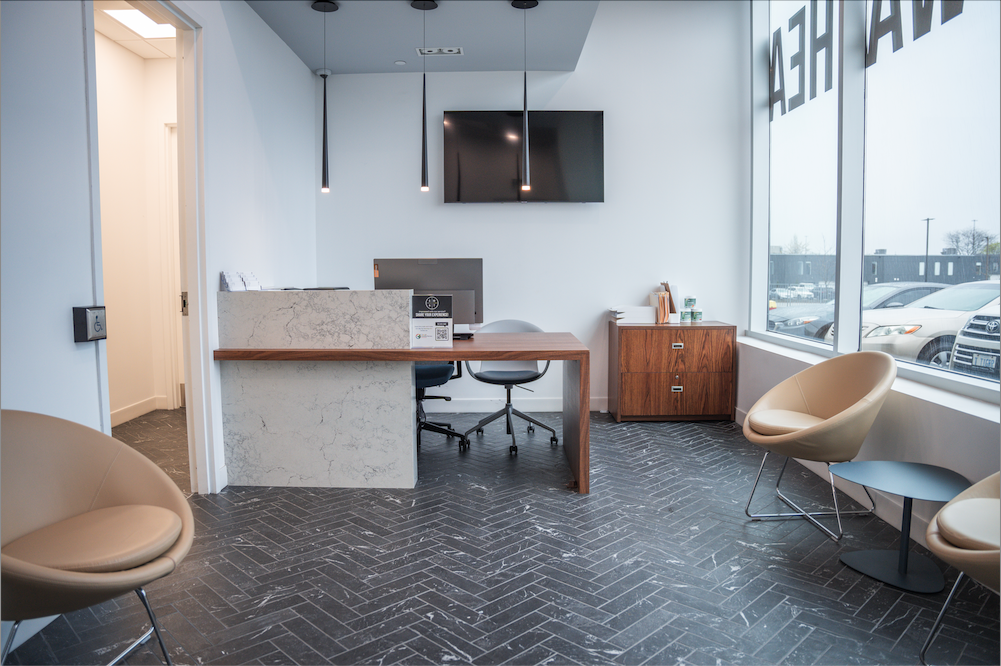
PEAC Health is a newly established wellness clinic located just outside of Toronto, offering a range of health services, including chiropractic care, physiotherapy, personal training, rehabilitation, and other wellness treatments. Since opening in August 2024, the clinic has been steadily growing its team and expanding its service offerings. However, to sustain this growth and establish itself as a trusted provider in the community, PEAC Health requires a strong online presence to attract clients, grow the business and stand out amongst competitors

The Problem
PEAC Health’s website was incomplete, poorly structured, and lacked a cohesive design. Users struggled to navigate the site, understand service offerings, and take action
Key UX challenges included:
Unclear site navigation
Lack of brand consistency
Weak or inconsistent call-to-action buttons
These issues directly impacted user engagement, reduced conversion rates, and ultimately led to lost revenue opportunities
Project Vision
-
✅ Build an Online Presence
As a brand-new clinic, the top priority was building visibility and credibility online to attract new clients
-
✅ Build Client Trust
Create a professional and consistent brand identity to increase trust and stand out from local competitors
-
✅ Promote Online Bookings
Streamline the booking process to drive appointment volume, boost revenue & long-term business growth
Persona Spectrums
Fact-based personas were developed by analyzing the clinic’s data records and patient trends on our Jane scheduling application
One core persona (office worker) and 2 extreme personas (athlete + retired senior) were chosen to highlight opposite ends of the spectrum. This approach ensures a diverse range of user needs and considerations are accounted for in the design process


How and why would a
user land the website?
-
Scenario 1️⃣
User needs immediate care (urgent booking)
-
Scenario 2️⃣
User casually researching and exploring services
-
Scenario 3️⃣
Returning patient booking follow-ups
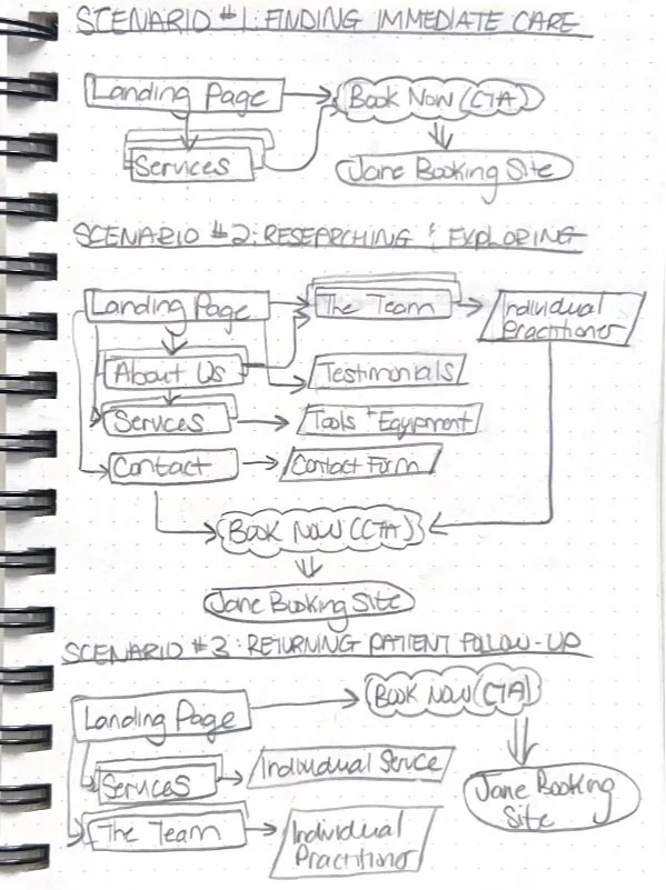
Activity Flows
For a wellness clinic, the journey often begins with a search that directs users to the website's landing page. Here, we recognize the importance of strategically placing call-to-action buttons (e.g., “Book Online,” “Book Your First Session”) throughout the site to optimize conversions for all possible scenarios
The consistent CTA prompts encourage engagement and and guide users towards the Jane Booking system
- this is our main goal!


Site Map
Should we implement a blog?
A gap analysis was conducted & revealed that a blog section was missing—an opportunity to boost SEO, drive organic traffic, and enhance user engagement through high-ranking keywords and education
However, with the current priority of first launching the fully functional website, the blog is not urgent at this stage but can be integrated post-launch to further strengthen the clinic’s digital presence and long-term growth
Organizing the content of the website
Since this is a new business and required the creation and refinement of nearly all website content, a quantitative content audit was conducted using an organized Excel spreadsheet. Each piece of content was systematically listed along with key metadata (title, description, content type, intended user journey, etc.) to ensure clarity, consistency, and strategic alignment with the site’s goals

Time for the fun.
Branding makeover
The only asset given to me was the black & white logo. From here, I developed a full brand identity after quite a bit of reflecting on our brand values, tone, and WHO we want to be perceived as


Wireframing with Purpose
I started mocking up the most critical pages first—Home, Services, Meet the Team and Contact Us, to ensure the core structure and content hierarchy were solid before expanding to the rest
This allowed me to validate layout decisions early with the team before scaling the design further
My core checklist
✅Clear & Consistent CTAs: at least 1 on every page to drive conversions
✅ Build Trust: Affiliate’s logo section + Google Reviews to reinforce credibility
✅ Encourage Engagement: Fillable forms, clickable buttons (i.e. Learn more, View Services, Meet the Team, etc.) for client interaction

Iterating through collaboration


Design is never a solo process. Although I was the only UX/UI designer for this project, I worked closely with the clinic owner and digital marketing agency for team decisions & feedback to ensure we were on the right path
We used WhatsApp for regular updates, weekly Google Meets Video meetings for important communication, and Figma threads for design QA
Bringing the iterations to life
With the core structure in place, the next big focus for the high-fidelity wireframes was making it effortless for users to take action—whether they were ready to book, researching services, or just exploring!
Highly visible CTA buttons and strategically placed button links were placed throughout the site to ensure that booking a session or engaging with the clinic is always just one click away. The inquiry form was also designed to help connect with potential clients, especially those who might have questions before booking


Designed for any type of client…
This prototype ensures an intuitive experience for all users:
☑️ New clients exploring care options
☑️ Returning clients rebooking in seconds
☑️ Curious users learning about services
Revisions before going live 🧐

And some final tweaks requested by the clinic owner…


Before launch, I worked closely with the dev team to QA over Figma to get down to the nitty gritty details and ensure the design was consistent & aesthetically pleasing to eye


So, what were the results?
✅ Fully functional and rebranded website
✅ 50%+ engagement rate from new users
✅ 20% increase in bookings via the website

What’s next for PEAC Health?
-
1️⃣ Ongoing Team Collaboration
Weekly meetings with the marketing team & clinic owner to optimize SEO and continuously brainstorm new UX improvements
-
2️⃣ Social Media Plan
Translate the brand identity to Instagram by creating consistent, branded content that reflects the clinic’s tone and aesthetic
-
3️⃣ Add a Blog
Introduce a blog section to improve search engine visibility, educate clients +
drive more organic traffic to the site
SOCIALS SNEAK PEAK
SOCIALS SNEAK PEAK


View other case studies

Fraud-Free Ticket Exchange
A trusted platform for secure ticket buying and selling for events in the EDM scene

Adding an AI Chat Feature
Helping online trainers save time and scale their business with personalized client support