

New Health Clinic Branding
A comprehensive brand identity redesign to modernize patient experience and establish trust in the digital healthcare space


MY ROLE
Lead Brand & UX Designer
TIMELINE
12 weeks (Q1 025)
TEAM
Jan-Apr 2025
TOOLS USED
Healthcare / Wellness
TOOLS USED

KEY DELIVERABLES
✓ Brand strategy & positioning
✓ Visual identity systeM
✓ Design system & component library
✓ Marketing website redesign
✓ Patient portal UI designs
THE CHALLENGE
Poor Online Visibility
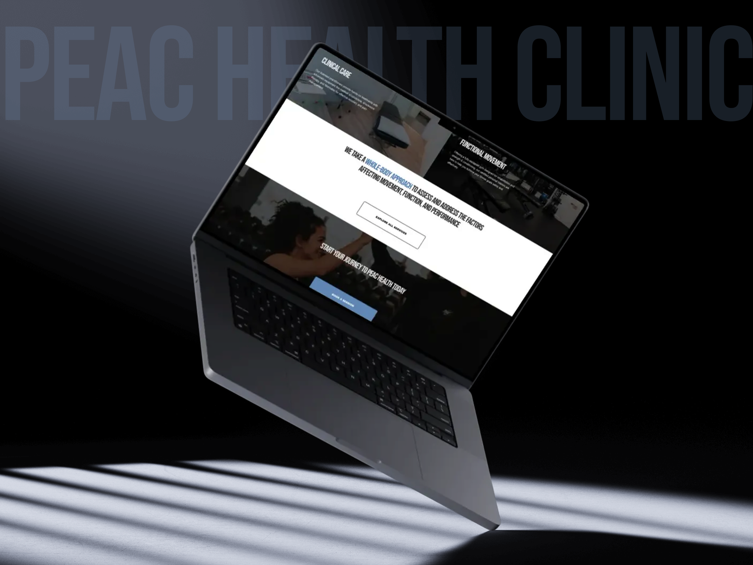
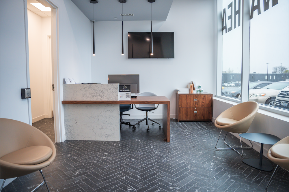
PEAC Health is a newly established wellness clinic located just outside of Toronto, offering a range of health services. Since opening in August 2024, the clinic has been steadily growing its team and expanding its service offerings. However, their existing digital experience was fragmented across multiple platforms with no cohesive design language, leading to patient confusion and reduced trust


MY PROCESS
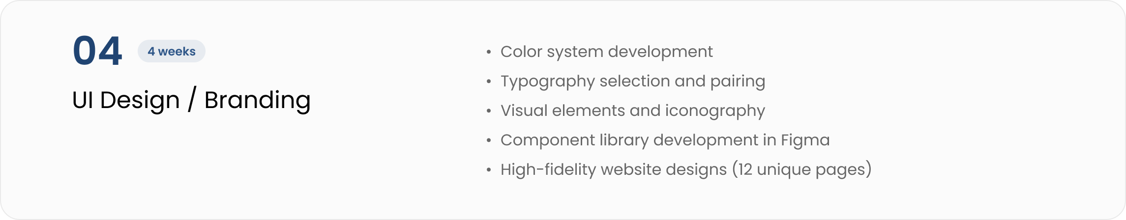
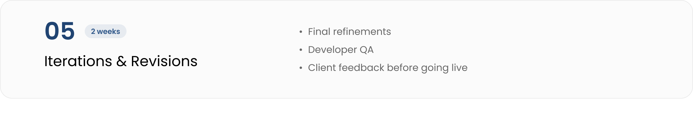
5-Phase Approach

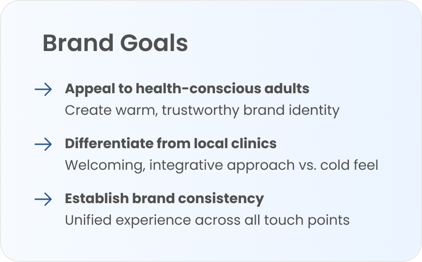
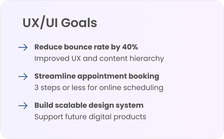
PROJECT OBJECTIVES
Goals & Success Metrics
Working closely with clinic leadership, we established clear objectives that would guide the rebrand and provide measurable outcomes. The new brand needed to honor the clinic's heritage while positioning them for future growth.
TARGET AUDIENCE
Persona Spectrums
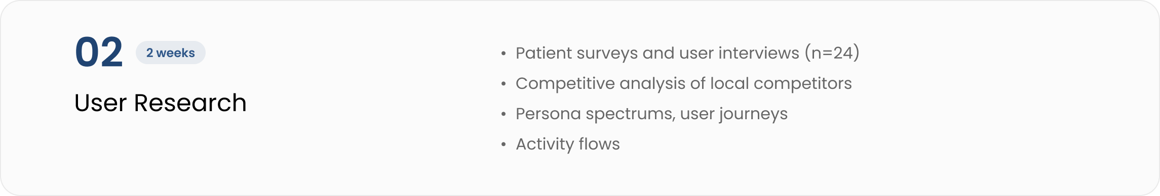
Fact-based personas were developed by analyzing the clinic’s data records and patient trends on our Jane scheduling application


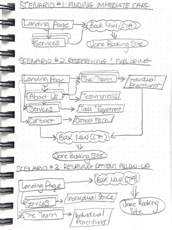
USER JOURNEY MAPPING
Activity Flows
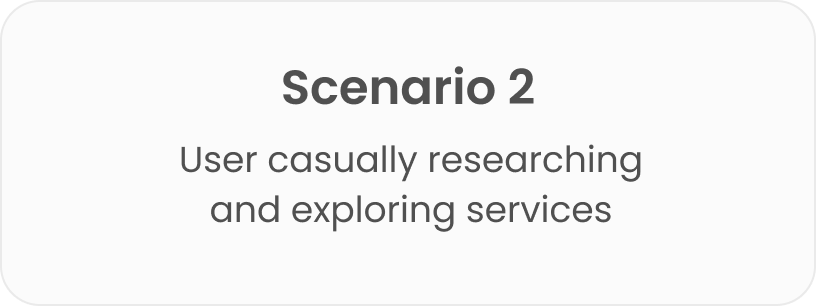
Mapping how different users would discover and interact with the website
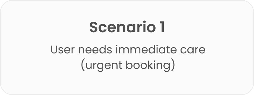
Primary Goal: Appointment Booking
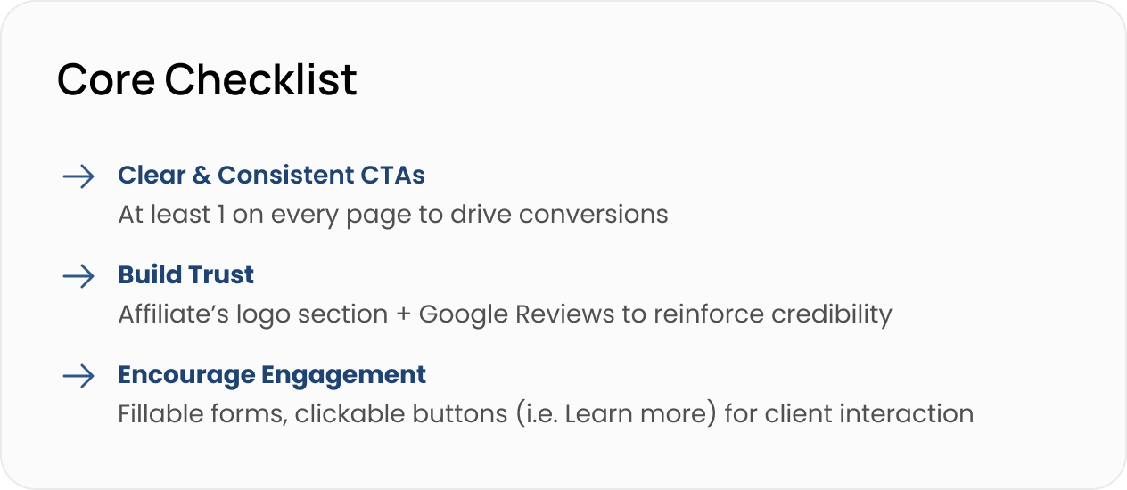
For a wellness clinic, the journey often begins with a search that directs users to the website's landing page. Here, we recognize the importance of strategically placing call-to-action buttons (e.g., “Book Online,” “Book Your First Session”) throughout the site to optimize conversions for all possible scenarios. The consistent CTA prompts encourage engagement and guide users towards the Jane Booking system

INFORMATION ARCHITECTURE
Site Map
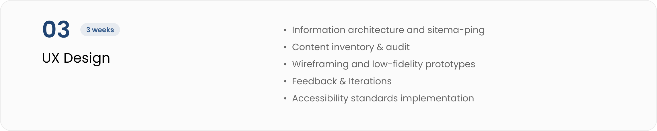
Designed a clear, logical site structure that prioritizes user and business goals

Content Inventory
A quantitative content audit was conducted using an organized Excel spreadsheet. Each piece of content was systematically listed along with key metadata (title, description, content type, intended user journey, etc.) to ensure clarity, consistency, and strategic alignment with the site’s goals.


DESIGN SYSTEM
Branding
A comprehensive design system to reflect our brand values, tone and who we want to be perceived as. This ensures brand consistency and enables rapid iteration across all digital touch points.

LOW-FIDELITY DESIGN
Key Screens
Iterating through collaboration
Design is never a solo process. Although I was the only UX/UI designer for this project, I worked closely with the clinic owner and digital marketing agency for team decisions & feedback to ensure we were on the right path. We used WhatsApp for regular updates, weekly Google Meets Video meetings for important communication, and Figma threads for design QA

ITERATIONS
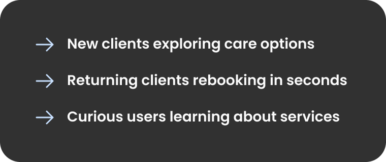
The priority frdihn focus was making it effortless for users to take action — whether they were ready to book, researching services, or just exploring.
Highly visible CTA buttons and strategically placed button links were placed throughout the site to ensure that booking a session or engaging with the clinic is always just one click away. The inquiry form was also designed to help connect with potential clients, especially those who might have questions before booking.

HIGH-FIDELITY DESIGN
Bringing the Iterations to Life

Before launch, I worked closely with the dev team to QA over Figma to get down to the nitty gritty details and ensure the design was consistent & aesthetically pleasing to eye
REVISIONS
Final tweaks before going live
Designed for all clients
This prototype ensures an intuitive experience for all users:
PROTOTYPE
Launched March 2025 with significant impact across brand perception, digital engagement, and business metrics.
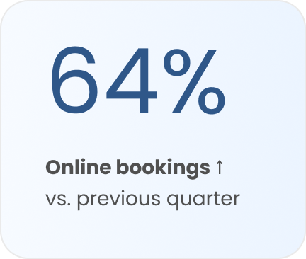
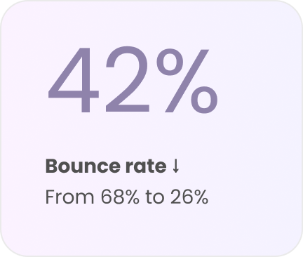
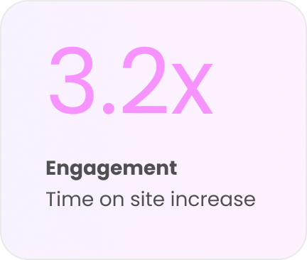
RESULLTS & IMPACT
Measurable Business Outcomes
REFLECTION
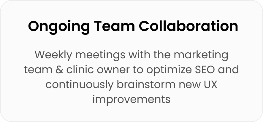
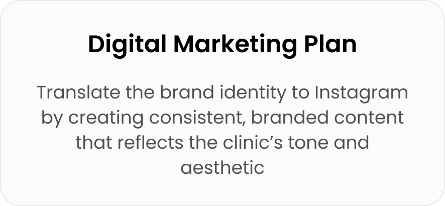
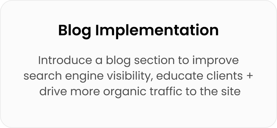
Next Steps
SOCIALS SNEAK PEAK
SOCIALS SNEAK PEAK


View other case studies
Fraud-Free Ticket Exchange
A trusted platform for secure ticket buying and selling for events in the EDM scene

Adding an AI Chat Feature
Helping online trainers save time and scale their business with personalized client support